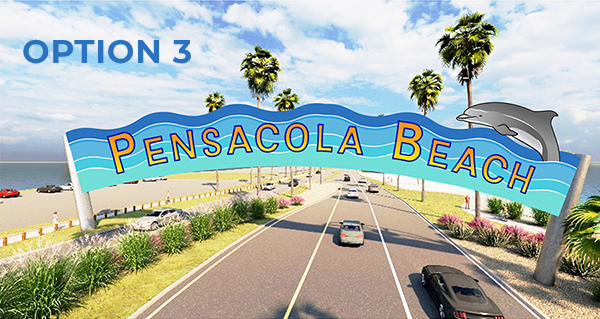
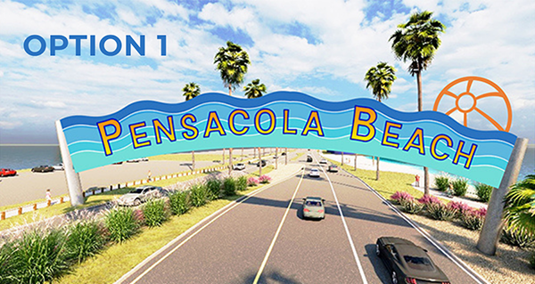
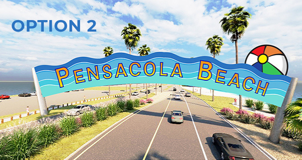
Readers are not impressed with Commissioner Ashlee Hofberger’s “new” renderings for her proposed new gateway to Pensacola Beach. The options boil down to Innisfree logo (1), Beach Ball (2), or Dolphin (3).
- Questions: Why didn’t she bring up these renderings at her Pensacola Beach town hall on May 28? Why is the deadline June 11 for voting, giving the public only five days to weigh-in?
From Instagram:
“Nope, nope and hell nope.
“Literally neither. Is it the drive to Disney World?!?!?”
“These are awful.”
“Terrible. There is plenty of great local creative talent. They need to hire a professional.”
“Woof. Someone take away this person’s Canva.”
“Is this serious?”
“First on still incorporates part of the Innisfree logo.”
“I can’t believe with all the local talent they are going to spend 1.4m on this!”
“2 — if these are the only options.”
“Option zero”
“Ummm this seems like a good opportunity to open up a submission from local artists.”
From Facebook:
“No sign that’s my Vote!”
“Why can’t we vote for dressing rooms, no additional hotels, and more parking?”
“Like everyone here, I think the sign is a waste of money. And with these amateur designs, may as well just say welcome to cheeseball beach. We have a sign coming into the beach welcoming you—the lit-up one. It’s mid-century modern feeling. If you absolutely have to still do this project then please hire Chris Bogan Creative to design it as these aren’t it. And I know I’ll catch hell for this, but that beach ball? Never liked it. It’s cheesy. Pensacola Beach should spend that money on a rebrand identity update. Stylistically, we should embrace and build off of our mid-century development era and the already great lit-up mid-century welcome sign we have. We need a more modern, clean look, not cartoons and bad fonts.”
“Well, the online form makes you choose an option or you can’t submit. I was trying to write in the comments that I choose none of the above. The design is terrible and all

A pretty-looking “toll both” is still a toll both. I recall the commissioners once discussing in a meeting that 80% of the tolls were paid by Escambia County residents. It’s a tax dressed up as a toll. Inweekly should review the history of the bridge toll. I once called county staff and was told that the toll is collected to service a bond for a project on Santa Rosa Island wholly unrelated to the bridge. I asked and was also told that other sources of revenues “could” be used to service that bond debt. What is the remaining bond debt and, legally, what other county revenue sources could be used to pay it off?
Definitely basic designs, no class or appeal at all. Do you think Gulf Shores, Orange Beach, Destin or Panama City would go for this? No way. The design looks cheap, boring and lazy. The font on the sign and windo stickers that were common in the 70’s and 80’s would be so much better. Some form of a scripted font, one that is not Innisfree would work. Very embarrassing designs. If you’re going to build it, don’t go cheap on the artwork. Use teal, aqua or similar color scheme that reflects the color of the gulf, not colors of a cheap tee shirt shop.